


TOKoR Comic: Update - 6/9
3 posters
Page 2 of 2
Page 2 of 2 • ![]() 1, 2
1, 2
![]()
 Re: TOKoR Comic: Update - 6/9
 by Guest Tue Apr 19, 2011 1:08 am
★ Comic 042
★ Comic 043
★ Comic 044
★ Comic 045
Been a while. Just keep going. Can't let go of it yet.
Haven't posted an official update since #28.
#29-45 are marked with red stars in the main image list if anyone cares to still keep up.
First introduction of darkness in the comic. Started when I was trying to figure out an easy way to illustrate Gwen turning off her lights and going to bed without losing any of the details of the drawings(if I tried to pencil the darkness in at all, it probably would have made things very difficult to see).
And just for the hell of it - and because it didn't make sense to draw the room so dark from the hallway and have Xander standing in silhouette unless the rest of the room was dark - I added the darkness to Alex's room as well. Please ignore the light outside in the one panel. I guess my original thought was a street light was the reason I did it, but it just turned out retarded. And I'm lazy...so it's gonna stay that way for now.
And yay, Jason! Not really hiding in the room, but I gotta figure out more crap to put in Alex's room...or something so Jason hides in plain sight.
Also using verbs as onomatopoeias. yaaaay... Blahblahblahblahblahblahblahblahblahblahblahblahblahblahb... more stuff. Enjoy.
Guest- Guest
![]()
![]()
Re: TOKoR Comic: Update - 6/9
by Guest Wed Apr 20, 2011 9:19 pm
★ Comic 046
★ Comic 047
★ Comic 048 - Bonus Dance
★ Comic 049
★ Comic 050
Alright, this is a pretty boring set. I was so excited and rushing to get to Jason, thinking, "Gotta get to Jason!Gotta gettoJasooooon!!!" And then it was GLORIOUS! Loved the smackdown! And now it's gone. I was also excited(but less so) for the "zap" and I hope you can tell what is happening on page 47. I tried my best to illustrate Alexander's powers without making it a visual "laser", because it's not...until much later.
Anyways, Jason's arrival is gone and done and things are boring again. Talking.Talking.Talking. Ugh! Have to keep finding interesting angles to draw these from and close-ups of Alex's face. -_- Things will probably be boring until the morning scenes - excited to draw those!
Oh! And congratulations! TOKoR Comic has reached page 50! Yaaaaaaaaaaaaaaaaaaaaaaaaaaaaaaaaaaaaaaaaaaaaaaaaaaaaaaaaaaayyyyyyyyyyyyyyyyyyyyy!!!!!!!!!
Still welcoming criticisms and opinions from those who wish to participate. Enjoy!
★ Comic 047
★ Comic 048 - Bonus Dance
★ Comic 049
★ Comic 050
Alright, this is a pretty boring set. I was so excited and rushing to get to Jason, thinking, "Gotta get to Jason!Gotta gettoJasooooon!!!" And then it was GLORIOUS! Loved the smackdown! And now it's gone. I was also excited(but less so) for the "zap" and I hope you can tell what is happening on page 47. I tried my best to illustrate Alexander's powers without making it a visual "laser", because it's not...until much later.
Anyways, Jason's arrival is gone and done and things are boring again. Talking.Talking.Talking. Ugh! Have to keep finding interesting angles to draw these from and close-ups of Alex's face. -_- Things will probably be boring until the morning scenes - excited to draw those!
Oh! And congratulations!
Still welcoming criticisms and opinions from those who wish to participate.
Enjoy!Last edited by TimeOfTheEye on Thu May 12, 2011 3:57 pm; edited 1 time in total
Guest- Guest
![]()
![]()
Re: TOKoR Comic: Update - 6/9
by Tartra Mon May 02, 2011 7:04 am
You don’t know how long I’ve been waiting to do this.
So, here’s how I’m gonna lay this out so you understand exactly why I’m saying... whatever it is I’m saying. Because you put this is up in critique, I’m absolving myself of any and all guilt (not that I ever had any to begin with; my lack of ‘DO THIS BETTER’ is truly always because... you did fantastically and what I am I supposed to point out?) and letting you know that anything I say is not to dictate what’s happening, but my opinion of ‘if I had a fraction of your talent (I don’t), this is how I would’ve done it’. You are more than welcome to ignore me on any/all points, but since you’ve been warned, it’s now safe to say that I’m gonna review the crap out of this. It’ll be glorious.
Intro 001
I take this as the first page, mostly because that’s where the roleplay itself started and this is perfectly suited for that job. In regards to this (and most of the intro), I’m working off a ‘well, this is clearly not the final product’ basis, so the ‘no background?!’ point is completely invalid, but I am excited to see how you colour the apartment, which I hope’ll be darker colours. I kind of see Alex as having the curtains drawn on a permanent basis. For the narrative, it’d flow a little better if you swapped ‘Not that Alex had been counting or anything’ with ‘And he still had enough breath...’, just so we have all the time on one side and then the little quip that follows it all.
Intro 002
Following that last point, the ‘Days, that was. Xander bitched for days’ words can go, so that it goes right from ‘... been counting or anything’ to ‘And for what...’.
I love the silhouette, and I especially love that I can appreciate it as an actual design because of the bottom right panel showing a close-up of his face. Not only does that save time (for you) on having to redraw him, but it reduces any detail-based clutter (for me) and puts the emphasis back onto the narrative and the expression on his face. All we needed from that one was the posture. My only thing with it is that it’s so nice, I can’t help but feel that’s what the first page art should’ve been, and what was used as the first page’s art should’ve been here. Going from the silhouette to the close-up seems like a clever way to visually introduce Alex. If you leave it the way it is but had ended up never using the silhouette idea, I’d’ve easily been happy and entertained, but because I got to see your artistic flair, I’m thinking you should use its impact straight away and where it’d be most effective rather than saving it for just a little later.
Intro 003
I can’t get over that there’re so many angles to look at him from! I was worried about how the long stretches of dialogue were going to be handled because I didn’t want to see the same pose over and over, just with slightly different expressions, but I didn’t realize that you going beyond ‘let’s look at the left side of his head! Now the right! Now the left!’ and letting me look up at him was going to be such a nice change of pace! The variety keeps my eyes well entertained.
The way you positioned the dialogue was smart as hell. I was gonna say ‘brilliant’, but I didn’t want to shoot for such a powerful adjective when I’m still only at the beginning. Regardless, I like the way it flows and I was delighted to find that I could naturally follow through to the next box without any trouble, putting that efficiency into the curved design. I’m also digging the fact that you put the smaller lines in a separate box. I don’t know if that was just to avoid a block of text (thank you), but specifically for the bottom three, that was exactly the spacing between each statement I was hoping for. For the first four, however, it seems easier to say it in my head if the first and second box were combined and third was closer to the second – not necessarily merged, but closer.
I adore the way you drew that curtain. The folds came out great.
Intro 004
The feet in the bottom left panel? Amazing. The curves are spot on and the way you drew his toes and made the folds for the ‘my left’ sock made it actually look like he’s wearing something rather than me thinking you just drew feet minus toes and plus a pattern on the heel. Ditto for the pants.
Folds are gonna be a reoccurring theme in this. Don’t even get me started on the jeans you draw later on, but you remember when I was going nuts over that Benoit House Party piece? What was the thing I said about it? I LOVE THIS MAN’S SHIRT. And pants. And badass pose, but mostly the shirt because it had so much detail in it. What’s more important, though, is that you keep a careful balance by never going overboard just to say it’s there but putting it in to make sure it’s realistic. That, in turn, brings up another reoccurring trait of yours: I will always drool over your mix of cartoon and realism. I’m still talking about the bottom left panel in particular, but the bottle to the right is another example: I can tell it’s a cartoon, but because there’s enough realistic aspects, I don't have to strain visualize anything else. If it had been hugely cartoony (and I mean your style in general), I’d’ve probably still liked it, but I would've had to become really familiar with your work to fill in any details I can’t immediately see (like movement). With this, I can flow between the panels so I’m not left thinking ‘How’d his arm go from there to there?’, but instead seeing it happen.
Intro 005
For the dialogue, is there any chance you add to Alex’s line ‘Yes. And caffeine would keep him awake’. That’s just because there’s a slightly different mood to the comic versus the RP, so a few extras words here and there would help translate the emotion. For the bottom of the top panel, I’m back to grouping dialogue. The first sentence is A-OK where it is, but it’d match better if the second sentence (‘At an early...’) was attached to the one on the left (‘As equally early...’).
I like the bottom left’s pose. Once again, I can see him turning to look over his shoulder rather than doing a start and stop ‘He is sitting this way. Now he is sitting this way’ deal.
For the dialogue on the bottom right panel, again to make translation, is it possible to squeeze in ‘Then just shut up. Please? For once.’ That’s actually a change I want to make in the RP itself. I might do that later, in fact.
Intro 006
The top panel – which, by the way, features exceptional shading on the fingers and fantastic curves for the knuckles, wrists and palms – is kind of confusing in terms of what’s happening. That’s straight-up my bad because you drew it exactly the way it happened. I don’t if this helps, but the specific narrative behind that narrative was that Xander challenging Alex to a fight but didn’t have the strength to do it. A new line of dialogue would probably be needed (for the RP as well), which, more than honestly, would be Xander saying, “I will kick the shit out of you right now.”
I like the way you used the full background for all the narrative in the bottom left. Alex’s pose has a natural slant to it that allows the words to roll right off (and could also be English Major’d into saying it’s a metaphor for him brushing off Xander’s threat ), but the effect isn’t fully there because there’s too much white space on the right of him. If Alex could just be shifted to the right to get rid of it, you’d get rid of the awkward gap and have more room to write in. Also, he looks adorable in that panel. Absolutely.
I know it’s work-in-progress, but the two right panels don’t look the same as the Alex in the other pages. They’re pointier. But the pacing they provide, where Alex is clearly shown waiting for an answer he doesn’t get, definitely completes the image.
[centre] * * * [/center]
I feel a little dumb pointing out anything about the art (work-in-progress, work-in-progress, work-in-progress) because I know it’s subject to change, but at least this way you know what I, personally, like or don’t like. Hopefully I can speak for others on that.
As far as the dialogue (what’s written and how it’s written), I’m assuming that (aside from the fact that you switched from writing it to typing and you’ll probably be switching it all to typing) that’s exactly how it’s gonna be in the final product, so I’m a little more seriously in that. I know I’m an amateur at art and it’s why I’m completely deferring to you, but I’m hoping my opinion is worth something when it comes to positioning the words and translating it.
... Uh... I’m gonna stop here just because I want to check if this helps at all. If not, I’ll go back to delighted squealing about how I’m ecstatic this is happening at all.
So, here’s how I’m gonna lay this out so you understand exactly why I’m saying... whatever it is I’m saying. Because you put this is up in critique, I’m absolving myself of any and all guilt (not that I ever had any to begin with; my lack of ‘DO THIS BETTER’ is truly always because... you did fantastically and what I am I supposed to point out?) and letting you know that anything I say is not to dictate what’s happening, but my opinion of ‘if I had a fraction of your talent (I don’t), this is how I would’ve done it’. You are more than welcome to ignore me on any/all points, but since you’ve been warned, it’s now safe to say that I’m gonna review the crap out of this.
Intro 001
I take this as the first page, mostly because that’s where the roleplay itself started and this is perfectly suited for that job. In regards to this (and most of the intro), I’m working off a ‘well, this is clearly not the final product’ basis, so the ‘no background?!’ point is completely invalid, but I am excited to see how you colour the apartment, which I hope’ll be darker colours. I kind of see Alex as having the curtains drawn on a permanent basis. For the narrative, it’d flow a little better if you swapped ‘Not that Alex had been counting or anything’ with ‘And he still had enough breath...’, just so we have all the time on one side and then the little quip that follows it all.
Intro 002
Following that last point, the ‘Days, that was. Xander bitched for days’ words can go, so that it goes right from ‘... been counting or anything’ to ‘And for what...’.
I love the silhouette, and I especially love that I can appreciate it as an actual design because of the bottom right panel showing a close-up of his face. Not only does that save time (for you) on having to redraw him, but it reduces any detail-based clutter (for me) and puts the emphasis back onto the narrative and the expression on his face. All we needed from that one was the posture.
My only thing with it is that it’s so nice, I can’t help but feel that’s what the first page art should’ve been, and what was used as the first page’s art should’ve been here. Going from the silhouette to the close-up seems like a clever way to visually introduce Alex. If you leave it the way it is but had ended up never using the silhouette idea, I’d’ve easily been happy and entertained, but because I got to see your artistic flair, I’m thinking you should use its impact straight away and where it’d be most effective rather than saving it for just a little later.Intro 003
I can’t get over that there’re so many angles to look at him from! I was worried about how the long stretches of dialogue were going to be handled because I didn’t want to see the same pose over and over, just with slightly different expressions, but I didn’t realize that you going beyond ‘let’s look at the left side of his head! Now the right! Now the left!’ and letting me look up at him was going to be such a nice change of pace! The variety keeps my eyes well entertained.
The way you positioned the dialogue was smart as hell. I was gonna say ‘brilliant’, but I didn’t want to shoot for such a powerful adjective when I’m still only at the beginning. Regardless, I like the way it flows and I was delighted to find that I could naturally follow through to the next box without any trouble, putting that efficiency into the curved design. I’m also digging the fact that you put the smaller lines in a separate box. I don’t know if that was just to avoid a block of text (thank you), but specifically for the bottom three, that was exactly the spacing between each statement I was hoping for. For the first four, however, it seems easier to say it in my head if the first and second box were combined and third was closer to the second – not necessarily merged, but closer.
I adore the way you drew that curtain. The folds came out great.
Intro 004
The feet in the bottom left panel? Amazing. The curves are spot on and the way you drew his toes and made the folds for the ‘my left’ sock made it actually look like he’s wearing something rather than me thinking you just drew feet minus toes and plus a pattern on the heel. Ditto for the pants.
Folds are gonna be a reoccurring theme in this. Don’t even get me started on the jeans you draw later on, but you remember when I was going nuts over that Benoit House Party piece? What was the thing I said about it? I LOVE THIS MAN’S SHIRT. And pants. And badass pose, but mostly the shirt because it had so much detail in it. What’s more important, though, is that you keep a careful balance by never going overboard just to say it’s there but putting it in to make sure it’s realistic. That, in turn, brings up another reoccurring trait of yours: I will always drool over your mix of cartoon and realism. I’m still talking about the bottom left panel in particular, but the bottle to the right is another example: I can tell it’s a cartoon, but because there’s enough realistic aspects, I don't have to strain visualize anything else. If it had been hugely cartoony (and I mean your style in general), I’d’ve probably still liked it, but I would've had to become really familiar with your work to fill in any details I can’t immediately see (like movement). With this, I can flow between the panels so I’m not left thinking ‘How’d his arm go from there to there?’, but instead seeing it happen.
Intro 005
For the dialogue, is there any chance you add to Alex’s line ‘Yes. And caffeine would keep him awake’. That’s just because there’s a slightly different mood to the comic versus the RP, so a few extras words here and there would help translate the emotion. For the bottom of the top panel, I’m back to grouping dialogue. The first sentence is A-OK where it is, but it’d match better if the second sentence (‘At an early...’) was attached to the one on the left (‘As equally early...’).
I like the bottom left’s pose. Once again, I can see him turning to look over his shoulder rather than doing a start and stop ‘He is sitting this way. Now he is sitting this way’ deal.
For the dialogue on the bottom right panel, again to make translation, is it possible to squeeze in ‘Then just shut up. Please? For once.’ That’s actually a change I want to make in the RP itself. I might do that later, in fact.
Intro 006
The top panel – which, by the way, features exceptional shading on the fingers and fantastic curves for the knuckles, wrists and palms – is kind of confusing in terms of what’s happening. That’s straight-up my bad because you drew it exactly the way it happened. I don’t if this helps, but the specific narrative behind that narrative was that Xander challenging Alex to a fight but didn’t have the strength to do it. A new line of dialogue would probably be needed (for the RP as well), which, more than honestly, would be Xander saying, “I will kick the shit out of you right now.”
I like the way you used the full background for all the narrative in the bottom left. Alex’s pose has a natural slant to it that allows the words to roll right off (and could also be English Major’d into saying it’s a metaphor for him brushing off Xander’s threat
), but the effect isn’t fully there because there’s too much white space on the right of him. If Alex could just be shifted to the right to get rid of it, you’d get rid of the awkward gap and have more room to write in. Also, he looks adorable in that panel. Absolutely.I know it’s work-in-progress, but the two right panels don’t look the same as the Alex in the other pages. They’re pointier. But the pacing they provide, where Alex is clearly shown waiting for an answer he doesn’t get, definitely completes the image.
[centre] * * * [/center]
I feel a little dumb pointing out anything about the art (work-in-progress, work-in-progress, work-in-progress) because I know it’s subject to change, but at least this way you know what I, personally, like or don’t like. Hopefully I can speak for others on that.
As far as the dialogue (what’s written and how it’s written), I’m assuming that (aside from the fact that you switched from writing it to typing and you’ll probably be switching it all to typing) that’s exactly how it’s gonna be in the final product, so I’m a little more seriously in that. I know I’m an amateur at art and it’s why I’m completely deferring to you, but I’m hoping my opinion is worth something when it comes to positioning the words and translating it.
... Uh... I’m gonna stop here just because I want to check if this helps at all. If not, I’ll go back to delighted squealing about how I’m ecstatic this is happening at all.

Tartra- Apparition

- Join date : 2010-07-10

Posts : 581
Age : 33
Location : Ottawa, Canada -

![]()
![]()
Re: TOKoR Comic: Update - 6/9
by Guest Mon May 02, 2011 12:51 pm
Woohoo!  This is exactly what I wanted and the reason why I put this in this section instead of the other. So you and others would feel free to offer criticism and input - particularly you though because even though I'm the one drawing it, I still consider it like the back-and-forth of the actual role-play as far as effort and creative/artistic control goes, because half of what I'm drawing is based on stuff you wrote. And I love and appreciate everything you said in your whole post.
As far as your critique/review:
I've been progressively realizing that even though these aren't the final pages, I'll create less work for myself if I go ahead and plan things the way I want them to look NOW, rather than add it later with the chance of not being happy with it and having to either fix it or "eh...leave it", so all I'll really need to worry about and focus on creating/thinking of is colors(while the rest of the stuff will be edits and changes here and there). I'm kind of hoping that I'll be able to get everything ironed out when I launch into the second draft and have it be the "final" draft. Might be hoping a little too much buuuuut... I'm aiming for that. So, no direct colors yet, but I'm definitely trying/going to try to add stuff in the background when there would be stuff in the background.
When originally drawing pages 1 and 2, I remember the way I thought of it was that it was somewhat dramatic to have Alex's face obscured until the next page. Which the silhouette and face close-up would still work with keeping the first picture of him "anonymous", but I see the silhouette as being a kind of "drawing back" and distancing from the audience with a more "internal thoughts" feel to it. When first drawing it, didn't work with him talking out loud right away. But now that I think about it and visualize it with the two things switched, it could work really well as a beginning picture(s) and probably be MORE dramatic and mysterious.
The bottom of page 3 was mostly that I wanted to show his room while he was thinking about it. But my writing is so big and sloppy, it takes up a bit of space and it was hard for me to position the blocks so you could still see the room and still read things in the right order. I've since then sort of redesigned his room, so I'll be changing things slightly anyway and will try and position things so that the top boxes are closer to each other. Because I agree, if only because my original reasoning for putting a box RIGHT in the middle of the room/panel was because sometimes I get worried things won't be clear to readers and feel the need/urge to bean people over the head/drag them on a leash to get them to realize "And now you read THIS one so your eyes go to the bottom of the page!" But it's not necessary to keep them in such a rigid flowing line, because if there's text boxes down there, people's eyes will naturally fall to the bottom of the page without needing to be "led/directed" there.
Thank you for your comments on my style. I'm really glad it's something you and others can enjoy. ^^
You can suggest ANY changes to dialogue and stuff I've written. A lot of times, I hyper focus and see the role-play playing in my head a certain way - basically exactly as I've drawn it matched with those words exactly. Sometimes, in an effort to stay close to the role-play like it's the Bible, and because the images in my head are so attached to the words themselves, I occasionally lose sight of what sounds good/natural. So, ALWAYS acceptable to offer changes for ANY of the dialogue, not just because you share the driver's seat with this thing, but also because of my blindspot being so focused. Most(if not all) of these changes as far as grouping text and adding/changing dialogue I will most definitely make on the redo.
As you've seen, it's been a struggle trying to figure out how to translate Xander taking over when his facial features changing aren't actually involved(which, his eyes and mouth will only change when he's actually talking out loud, unless you say something like "Xander smirked"). And most of the time, my explicitly stating or trying to hint at it, doesn't make it clear(and "twitching" isn't enough either). So, I'm definitely going to need something(if not the jagged lines I use to surround panels now then something else just as visually "different" and clear) to indicate visually as well as textually when Xander is taking over only parts of the body, or struggling for control.
I definitely appreciate all of your suggestions whether in regards to how a panel or drawing could be different or the dialogue. Even though you're involved in the project, you're still an objective viewer of the art itself. I desire it to look good and remain interesting. Sometimes, I get excited about certain "scenes" and try and rush things to get to them quicker and I tend to get a little repetitive; sometimes, it can be alright to have it looking a bit normal before we get to a "big" scene with different angles and flashy looking panels. But I need to know when it's too repetitive or wonky or boring, so that I can capture interest and keep it.
And as far as Alex's features, in these first pages, I was still trying to figure out how I wanted to draw him and how it would be easiest to draw him when I get to drawing him over and over(which, the really thick eyebrows the way they're drawn in these first pages ended up taking up too much space on his face and being cumbersome to draw, and became just thick "lines" instead). And sometimes, I draw his nose extended out too far. D:
I'd definitely love to hear/read anything you'd have to say about the other pages, but I won't demand that you find something to say about EVERY page. Whatever thoughts and opinions come to mind, let me know!
As far as your critique/review:
I've been progressively realizing that even though these aren't the final pages, I'll create less work for myself if I go ahead and plan things the way I want them to look NOW, rather than add it later with the chance of not being happy with it and having to either fix it or "eh...leave it", so all I'll really need to worry about and focus on creating/thinking of is colors(while the rest of the stuff will be edits and changes here and there). I'm kind of hoping that I'll be able to get everything ironed out when I launch into the second draft and have it be the "final" draft. Might be hoping a little too much buuuuut... I'm aiming for that. So, no direct colors yet, but I'm definitely trying/going to try to add stuff in the background when there would be stuff in the background.
When originally drawing pages 1 and 2, I remember the way I thought of it was that it was somewhat dramatic to have Alex's face obscured until the next page. Which the silhouette and face close-up would still work with keeping the first picture of him "anonymous", but I see the silhouette as being a kind of "drawing back" and distancing from the audience with a more "internal thoughts" feel to it. When first drawing it, didn't work with him talking out loud right away. But now that I think about it and visualize it with the two things switched, it could work really well as a beginning picture(s) and probably be MORE dramatic and mysterious.
The bottom of page 3 was mostly that I wanted to show his room while he was thinking about it. But my writing is so big and sloppy, it takes up a bit of space and it was hard for me to position the blocks so you could still see the room and still read things in the right order. I've since then sort of redesigned his room, so I'll be changing things slightly anyway and will try and position things so that the top boxes are closer to each other. Because I agree, if only because my original reasoning for putting a box RIGHT in the middle of the room/panel was because sometimes I get worried things won't be clear to readers and feel the need/urge to bean people over the head/drag them on a leash to get them to realize "And now you read THIS one so your eyes go to the bottom of the page!" But it's not necessary to keep them in such a rigid flowing line, because if there's text boxes down there, people's eyes will naturally fall to the bottom of the page without needing to be "led/directed" there.
Thank you for your comments on my style. I'm really glad it's something you and others can enjoy. ^^
You can suggest ANY changes to dialogue and stuff I've written. A lot of times, I hyper focus and see the role-play playing in my head a certain way - basically exactly as I've drawn it matched with those words exactly. Sometimes, in an effort to stay close to the role-play like it's the Bible, and because the images in my head are so attached to the words themselves, I occasionally lose sight of what sounds good/natural. So, ALWAYS acceptable to offer changes for ANY of the dialogue, not just because you share the driver's seat with this thing, but also because of my blindspot being so focused. Most(if not all) of these changes as far as grouping text and adding/changing dialogue I will most definitely make on the redo.
As you've seen, it's been a struggle trying to figure out how to translate Xander taking over when his facial features changing aren't actually involved(which, his eyes and mouth will only change when he's actually talking out loud, unless you say something like "Xander smirked"). And most of the time, my explicitly stating or trying to hint at it, doesn't make it clear(and "twitching" isn't enough either). So, I'm definitely going to need something(if not the jagged lines I use to surround panels now then something else just as visually "different" and clear) to indicate visually as well as textually when Xander is taking over only parts of the body, or struggling for control.
I definitely appreciate all of your suggestions whether in regards to how a panel or drawing could be different or the dialogue. Even though you're involved in the project, you're still an objective viewer of the art itself. I desire it to look good and remain interesting. Sometimes, I get excited about certain "scenes" and try and rush things to get to them quicker and I tend to get a little repetitive; sometimes, it can be alright to have it looking a bit normal before we get to a "big" scene with different angles and flashy looking panels. But I need to know when it's too repetitive or wonky or boring, so that I can capture interest and keep it.
And as far as Alex's features, in these first pages, I was still trying to figure out how I wanted to draw him and how it would be easiest to draw him when I get to drawing him over and over(which, the really thick eyebrows the way they're drawn in these first pages ended up taking up too much space on his face and being cumbersome to draw, and became just thick "lines" instead). And sometimes, I draw his nose extended out too far. D:
I'd definitely love to hear/read anything you'd have to say about the other pages, but I won't demand that you find something to say about EVERY page.
Whatever thoughts and opinions come to mind, let me know!
Guest- Guest
![]()
![]()
Re: TOKoR Comic: Update - 6/9
by Guest Thu May 12, 2011 4:22 pm
★ Comic 051
★ Comic 052
★ Comic 053
★ Comic 054
Alriiiiight! New pages! I really enjoyed drawing the top left panel of Jason's face, on page 51. XD OMG, so cute! I made his eyes all rolled back in his head and started cracking up. Then just a couple of small lines underneath to give his eyes a "tired" look and I fell off my seat, laughing. Love that picture. ^^
But yeah, the rest of that page sucks. The problem is, when the drawings get really small, I get the urge to draw them big about half-way through. So, they come out looking dis-proportioned and crappy. =/
Page 52: in the role-play, it says that Alex tied him around his thighs too, but when I drew Jason's legs together....it kinda looked effeminate. <.< So, I think I'm just gonna put another rope around his stomach and then have his feet tied to the legs of the chair. Kinda perverse having him spread his legs like that, but it's better than him looking like he's trying to imitate a prim and proper Southern Belle sittin' lady-like and fanning herself.
Then I had a lot of trouble moving on. 8[ In the role-play, it says nothing about Alex undressing, but in the "next morning" scenes, he puts on a shirt so... and I figure it's kinda weird...maybe...a little bit(I don't know; I'm not a guy), for him to hop into bed with all his clothes on.
...
Alright. So, I just wanted to draw him shirtless. Is that a crime??? But next are the "morning scenes" so yaaaaaayyyyy!!! =D
Annnnd this should be the end of that "nighttime/gray" coloring for a long while - I don't think we have anymore scenes where people walk around with the lights off. The dawn on page 54 looks better in the smaller view. I couldn't get GIMP to cooperate and put the sky color BEHIND the buildings, so everything kinda looks blocky and half-assed. Also, Gwen is still in her apartment; she's not running around the hall in her underwear, just FYI. Anyways, enjoy!
Guest- Guest
![]()
![]()
Re: TOKoR Comic: Update - 6/9
by Guest Tue May 17, 2011 9:17 pm
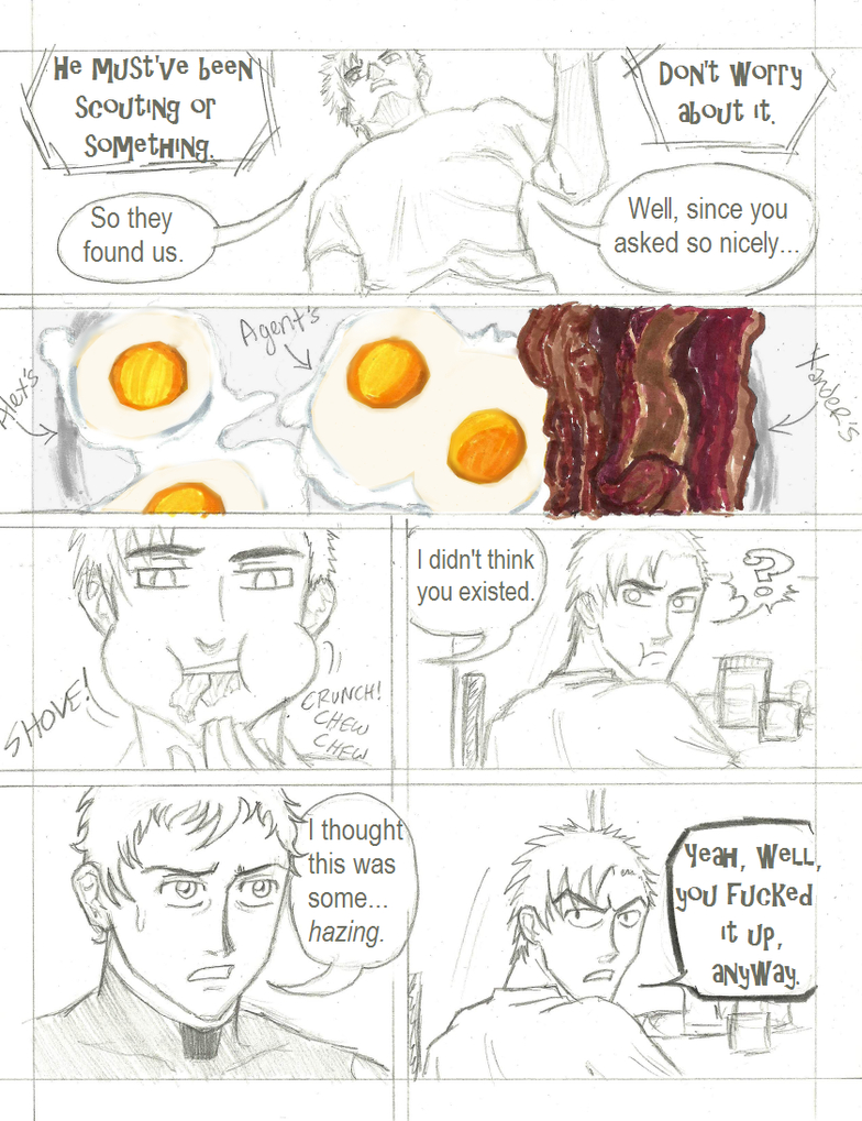
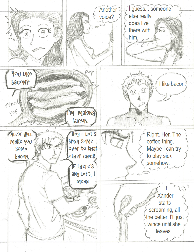
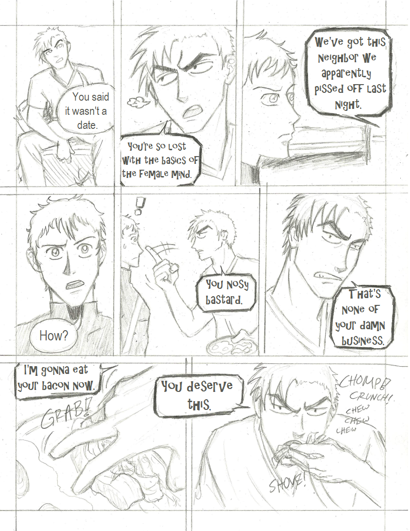
★ Comic 055
★ Comic 056
★ Comic 057
★ Comic 058
Not too many notes for this set. This is part one of my beloved "morning pages" that I've been so excited about for the past several weeks. I like drawing people doing things. One of my favorites(besides all the shirtless Alex panels) is the one of Xander flossing his teeth. So much fun. Gwen also has a morning routine, but I'm thinkin' I might skip it and just draw her "ready" when Alex goes over and she answers the door.
Also, something a bit different: color. I love to sketch and blahblahblah, but my first love is color. I adore coloring things. Occasionally(well, LATELY) I get the urge to color certain panels. Like, the dawn in the last set was just made all that more powerful by adding the color to it. The eggs would have been kinda hard to tell what they were without color, so I splashed some on them. Then page 58, I had originally planned just to do the red background. But the further I went the more I kept adding. Kinda like this: "Colored the background red. Ahhh...that's nice. <_< >_> <_< Maybe I'll ink it as well...and color the words...and his shirt....a little bit..." etc., etc. until the whole thing was colored. I regret nothing.
Guest- Guest
![]()
![]()
Re: TOKoR Comic: Update - 6/9
by Guest Thu Jun 09, 2011 10:13 pm

(click images for larger versions)
Comics 059-062
Alright. This set... I did awful on all of these pages. There's a few good things here and there, but I feel like the pacing, and the affect/facial expressions were more often than not completely wrong. Rather than pointing out and explaining everything, how about we play a game? It's called "Can You Spot Where TotE Screwed Up?" =D


Eric Doodles 01-02
Bonus pictures! He's not even close to being in the comic yet, but recently, Tartra posted for the role-play and I had the overwhelming urge to draw Eric. So, these pictures are illustrating a scene on page 9 of the role-play. I always imagine cartoon Eric as being really expressive and emotional with his facial features and his body language. I was trying to draw that, but a lot of times, in order to show his body, I couldn't actually draw his eyes because his face ended up being too small. Sadness...

Guest- Guest
![]()
![]()
Page 2 of 2 • ![]() 1, 2
1, 2
![]()

 Similar topics
» TOKoR Artbook
» ✦ The TOKoR Mini Wiki ✧
» I Spy With my little Eye... A comic on the Web!
» Trying Human -- An Alien Web Comic
» Need someone to draw/animate for web comic
» ✦ The TOKoR Mini Wiki ✧
» I Spy With my little Eye... A comic on the Web!
» Trying Human -- An Alien Web Comic
» Need someone to draw/animate for web comic
Page 2 of 2
Permissions in this forum:
You cannot reply to topics in this forum|
|
|
