


Emoria Character Icons
Page 3 of 7 • ![]() 1, 2, 3, 4, 5, 6, 7
1, 2, 3, 4, 5, 6, 7 ![]()
![]()
 Re: Emoria Character Icons
 by Gadreille Thu Feb 04, 2010 1:03 am
I know Kalon is against the idea of color coding, but I really wish that is how it would be constructed. I tend to see the color and immediately link the color to a specific person. For example, I see pink and I know it's Sigh's character. Light Blue=Kathryn Lacey. Kalon=Forest Green. Ryona=Purple. My brain works faster that way than trying to remember who is who. I dunno, it might just be my brain that works that way though.

Gadreille- ★ Administrator ★

- Join date : 2009-07-26

Posts : 5276
![]()
![]()
Re: Emoria Character Icons
by Kathryn Lacey Thu Feb 04, 2010 1:18 am
No. It's not just your brain that's working that way. Mine's been doing it, too. XD
I don't know why colour coding is so bad if everyone has the same graphics style. I mean, maybe the thing could be coloured with a person's associated colour and trimmed in silver or gold ((whichever one the person prefers))?
Kathryn Lacey- ★ Administrator ★
- Join date : 2009-05-28
Posts : 6968
![]()
![]()
Re: Emoria Character Icons
by Sighlent Thu Feb 04, 2010 6:17 am
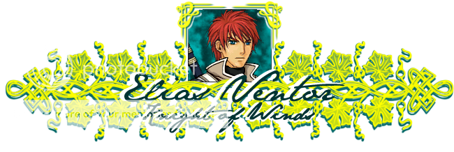
Here it is you guys:
Sighlent- Ghost

- Join date : 2009-05-29
Posts : 1391
Age : 34
Location : Home away from home, Virginia -

![]()
![]()
Re: Emoria Character Icons
by Kathryn Lacey Thu Feb 04, 2010 10:37 am
Otherwise, I really love the boarder you have around the portrait itself, and I really like the graphics. I was afraid that maybe number six would be a little too feminine for the guys, but it works really well for them, too, now that I see it.
Kathryn Lacey- ★ Administrator ★
- Join date : 2009-05-28
Posts : 6968
![]()
![]()
Re: Emoria Character Icons
by Sighlent Thu Feb 04, 2010 11:06 am
Kathryn Lacey wrote:Personally, I really like it. I only have two qualms: 1. The font is a little difficult to read. It may be the colour, but it could also just be the style. 2. The forum cuts off the end of it.
Otherwise, I really love the boarder you have around the portrait itself, and I really like the graphics. I was afraid that maybe number six would be a little too feminine for the guys, but it works really well for them, too, now that I see it.
The text was very hard to put on over that gold. Just because the gold is so bright and dark at the same time. If that makes sense. No worries about the size though! I saved a template to where all I have to do is insert the pictures and do the colors which can easily enough be re-worked in Gunneh's case. I also now know to delve under the size I did for this one.
Sighlent- Ghost
- Join date : 2009-05-29
Posts : 1391
Age : 34
Location : Home away from home, Virginia -
![]()
![]()
Re: Emoria Character Icons
by Kathryn Lacey Thu Feb 04, 2010 11:09 am
Maybe you should try doing the graphic part in silver instead of gold? That may help the text stand out more and be easier to read?
Kathryn Lacey- ★ Administrator ★
- Join date : 2009-05-28
Posts : 6968
![]()
![]()
Re: Emoria Character Icons
by Sighlent Thu Feb 04, 2010 11:11 am
Kathryn Lacey wrote:It makes sense to me. I've done enough editing of things, trying to add text to them that I can understand.
Maybe you should try doing the graphic part in silver instead of gold? That may help the text stand out more and be easier to read?
I could try that. But I'm afraid that the white might blend in to well with that...I guess I could always substitute the white for another color. I'll have to see.
Sighlent- Ghost
- Join date : 2009-05-29
Posts : 1391
Age : 34
Location : Home away from home, Virginia -
![]()
![]()
Re: Emoria Character Icons
by Sighlent Thu Feb 04, 2010 12:01 pm
*Edit: It just blends too well into the background of the thread along with certain character colors.
Sighlent- Ghost
- Join date : 2009-05-29
Posts : 1391
Age : 34
Location : Home away from home, Virginia -
![]()
![]()
Re: Emoria Character Icons
by Sighlent Thu Feb 04, 2010 2:42 pm
Sighlent- Ghost
- Join date : 2009-05-29
Posts : 1391
Age : 34
Location : Home away from home, Virginia -
![]()
![]()
Re: Emoria Character Icons
by Gadreille Thu Feb 04, 2010 3:00 pm
& drop shadow the name instead of the white engraved look?
Gadreille- ★ Administrator ★
- Join date : 2009-07-26
Posts : 5276
![]()
![]()
Re: Emoria Character Icons
by Kathryn Lacey Thu Feb 04, 2010 7:53 pm
That bright yellow-gold is just... too much for me, personally.
Kathryn Lacey- ★ Administrator ★
- Join date : 2009-05-28
Posts : 6968
![]()
![]()
Re: Emoria Character Icons
by Gadreille Thu Feb 04, 2010 7:54 pm

Gadreille- ★ Administrator ★
- Join date : 2009-07-26
Posts : 5276
![]()
![]()
Re: Emoria Character Icons
by Weiss Fri Feb 05, 2010 2:30 pm
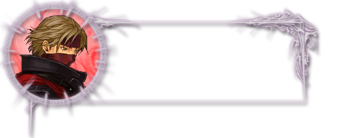
Before I get too far into it, what do you all think of something like this?

Weiss- Poltergeist

- Join date : 2009-08-02

Posts : 798
Age : 38
Location : Delaware, United States
![]()
![]()
Re: Emoria Character Icons
by Dax Fri Feb 05, 2010 2:51 pm
I like it, for sure.

Dax- Ghost
- Join date : 2009-10-19
Posts : 1766
Location : Montreal
![]()
![]()
Re: Emoria Character Icons
by Kathryn Lacey Fri Feb 05, 2010 2:56 pm
I've always loved simplicity, personally. I'm pretty much sold on that, but others' opinions are necessary. I think it's perfect, though. It has a fantasy feel, and it highlights each character. Each character may also have their own coloured portrait background that would go with either gold or with silver with great ease.
Kathryn Lacey- ★ Administrator ★
- Join date : 2009-05-28
Posts : 6968
![]()
![]()
Re: Emoria Character Icons
by Weiss Fri Feb 05, 2010 3:36 pm

As you can see, it's just a matter of changing the portrait and making the background color match, but it adds a pretty big spark of customization for each character.
A prospective finished versions of the above:

Weiss- Poltergeist
- Join date : 2009-08-02
Posts : 798
Age : 38
Location : Delaware, United States
![]()
![]()
Re: Emoria Character Icons
by Gadreille Fri Feb 05, 2010 3:46 pm
Very nice!
Gadreille- ★ Administrator ★
- Join date : 2009-07-26
Posts : 5276
![]()
![]()
Re: Emoria Character Icons
by Kathryn Lacey Fri Feb 05, 2010 3:56 pm
Kathryn Lacey- ★ Administrator ★
- Join date : 2009-05-28
Posts : 6968
![]()
![]()
Re: Emoria Character Icons
by Loki Fri Feb 05, 2010 4:14 pm


Loki- Guardian Ghost

- Join date : 2009-06-03
Posts : 2275
Age : 38
Location : Ohio
![]()
![]()
Re: Emoria Character Icons
by Kathryn Lacey Fri Feb 05, 2010 4:26 pm
Kathryn Lacey- ★ Administrator ★
- Join date : 2009-05-28
Posts : 6968
![]()
![]()
Re: Emoria Character Icons
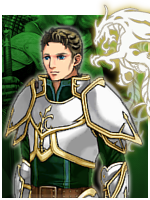
by Kalon Ordona II Fri Feb 05, 2010 5:30 pm
Weiss nailed the elegant simplicity I think we need.
I did have a much cooler version of the one I made, but I forgot to put it on my flash drive, and anyway I'm not sure it stands up to Weiss's. we'll see. ^^
If we go with Weiss's, what do you guys think of a platinum color? Too much? Right now it kinda looks like some sort of crystal, which is cool. We could also try silver, or make it brighter and say mithril. xD
We might also want to try a version where the text box has less height, depending on the font. I'd rather have everyone's font be the same size, if we can, so let's choose a version that can fit whoever has the longest name and title.
Kalon Ordona II- Global Moderator

- Join date : 2009-06-30
Posts : 5602
Age : 35
Location : near Seattle, Washington -
![]()
![]()
Re: Emoria Character Icons
by Weiss Fri Feb 05, 2010 6:14 pm
The only real difference between platinum and silver is that silver is more reflective, so it's shinier. Platinum is dull unless it's rhodium plated. Thus, I don't think using platinum for the frame would be much of a benefit, since I'd basically just be removing the glow effect that gives it the shiny look.
The current color is about as close as you'll get to silver without it being overwhelmingly bright. Too much white condensed into a small area becomes very unappealing, so I layered in a soft violet glow to prevent that. If the lines were thicker, I could have used a satin filter to dim some of the surface area, but that can't be done on smaller lines.
Mithril is silver in color, anyway, so that wouldn't change much. The difference between the metals is that mithril is a higher density (hard) metal, while silver is a soft metal.
For everyone to have the same size font, some instances will cause there to be an excessively high amount of blank space left in the box, which is a very unattractive flaw. The best bet is to simply make the font bigger or smaller depending on the number of characters while confining the overall text to a similar area.
In other words, to make "Weiss" take up the same space as "Kalon Ordona II" you would simply enlarge the font for Weiss and stretch the letters as much as possible without making them look unappealing.
Shrinking the text box or forcing a uniformity in size would mean that shorter names would be inherently less appealing than longer ones, since they would receive less display room. I think Kathryn's idea of using larger fonts for smaller names and smaller fonts for larger names will be a great deal more attractive.
This is all assuming that everyone decides they want to use my frame in the first place. I'm rather interested in seeing what you came up with before a decision is made, since I thought your frame had a more medieval fantasy element to it. It just needed more polish.
Weiss- Poltergeist
- Join date : 2009-08-02
Posts : 798
Age : 38
Location : Delaware, United States
![]()
![]()
Re: Emoria Character Icons
by Kalon Ordona II Fri Feb 05, 2010 6:35 pm
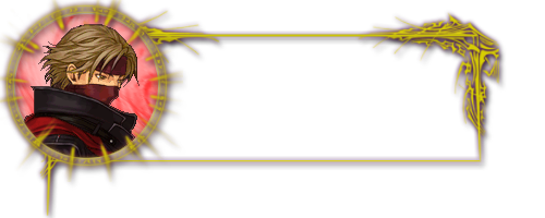
I undid the embossing, so now it's more flat, but I think it's better that way. It's still 3D-ish.
Right now I've got it looking like silver with some moss or plants growing on it. Sort-of a happy accident, but I think it fits more races this way, and it really gives it a dash of Epic. ^^
As for the font, no worries; I wasn't suggesting a more elaborate one, and that's a good point about just adding the marks in manually. ^^
Kalon Ordona II- Global Moderator
- Join date : 2009-06-30
Posts : 5602
Age : 35
Location : near Seattle, Washington -
![]()
![]()
Re: Emoria Character Icons
by Sighlent Fri Feb 05, 2010 11:20 pm
Sighlent- Ghost
- Join date : 2009-05-29
Posts : 1391
Age : 34
Location : Home away from home, Virginia -
![]()
![]()
Re: Emoria Character Icons
by Kathryn Lacey Fri Feb 05, 2010 11:46 pm
I also like the fonts that were chosen with the frame, personally. They work well with the role play.
Anyway, I'll wait to see Kalon's before voicing my final opinion on the one that would be used for the role play.
Kathryn Lacey- ★ Administrator ★
- Join date : 2009-05-28
Posts : 6968
![]()
![]()
Re: Emoria Character Icons
by Kalon Ordona II Sat Feb 06, 2010 2:32 pm
I'm starting to think that this, too, looks a little pixel-y... but if Weiss or someone likes it and wants to polish it or make some derivative, that'd be sweet! xD

Kalon Ordona II- Global Moderator
- Join date : 2009-06-30
Posts : 5602
Age : 35
Location : near Seattle, Washington -
![]()
![]()
Re: Emoria Character Icons
by Kathryn Lacey Sat Feb 06, 2010 2:59 pm
Kathryn Lacey- ★ Administrator ★
- Join date : 2009-05-28
Posts : 6968
![]()
![]()
Re: Emoria Character Icons
by Kalon Ordona II Sat Feb 06, 2010 3:05 pm
Kathryn, you've probably told people this before, but are you using a 1024 x 768 screen resolution? Most websites nowadays seem to be arranged around 1152 x 864 or 1280 x 1024.
I normally use 1152 x 864.
We could resize it to 500 or so pixels--as long as the picture frame stays the same--but that might give very little room for words.
I could work on it some more and change the vines around the frame so that they're smaller. That could work.
Edit:
actually, though, maybe the easiest thing would be to pull in the empty space around the middle leaves of the word box.
Kalon Ordona II- Global Moderator
- Join date : 2009-06-30
Posts : 5602
Age : 35
Location : near Seattle, Washington -
![]()
![]()
Re: Emoria Character Icons
by Kathryn Lacey Sat Feb 06, 2010 3:17 pm
Kathryn Lacey- ★ Administrator ★
- Join date : 2009-05-28
Posts : 6968
![]()
![]()
Re: Emoria Character Icons
by Kalon Ordona II Sat Feb 06, 2010 3:27 pm
Yeah, the older computers didn't have the higher resolutions.
Actually I think it goes by the Operating System.
Kalon Ordona II- Global Moderator
- Join date : 2009-06-30
Posts : 5602
Age : 35
Location : near Seattle, Washington -
![]()
![]()
Page 3 of 7 • ![]() 1, 2, 3, 4, 5, 6, 7
1, 2, 3, 4, 5, 6, 7 ![]()
![]()

 Similar topics
|
|
|
